
Artist Biography
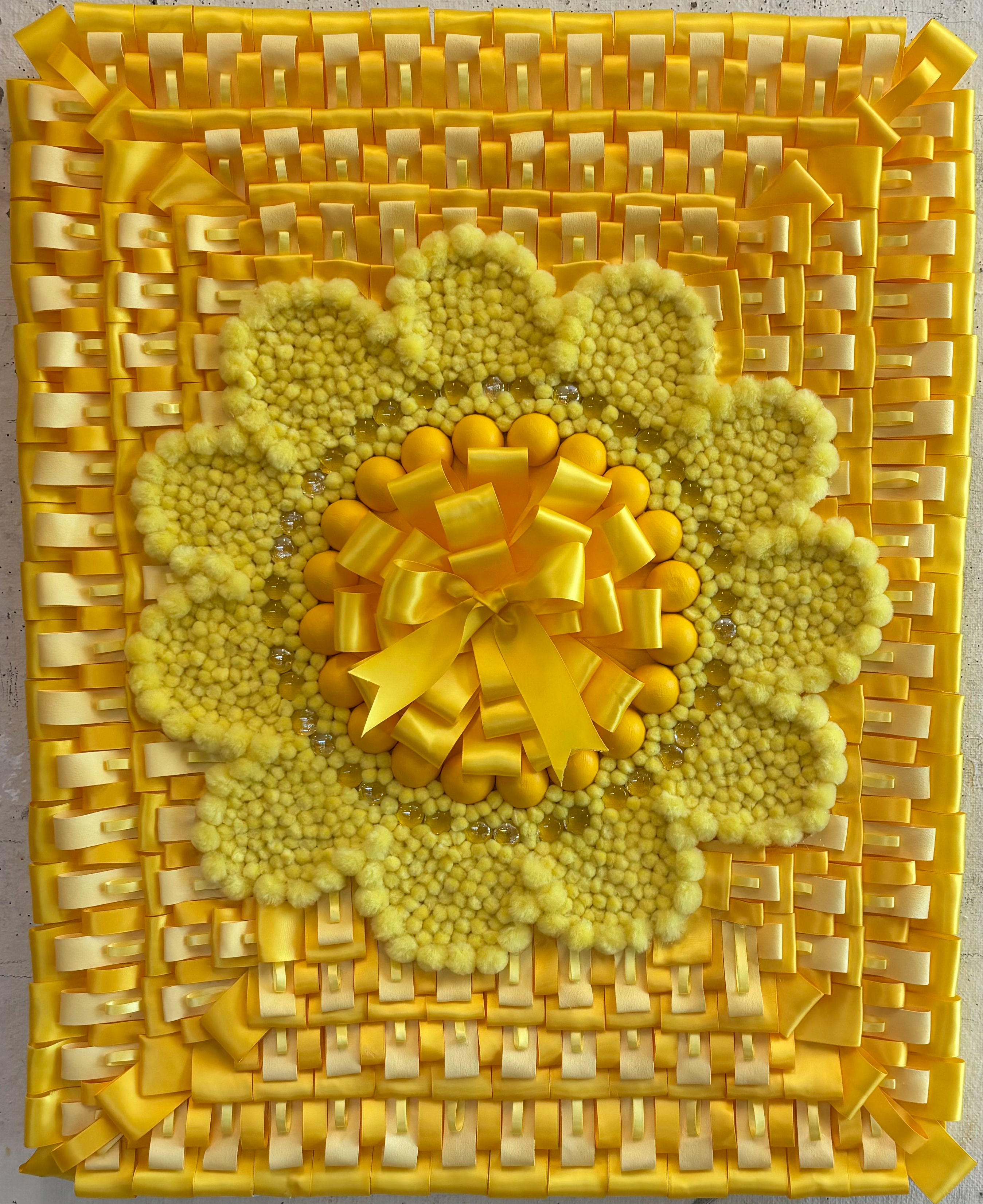
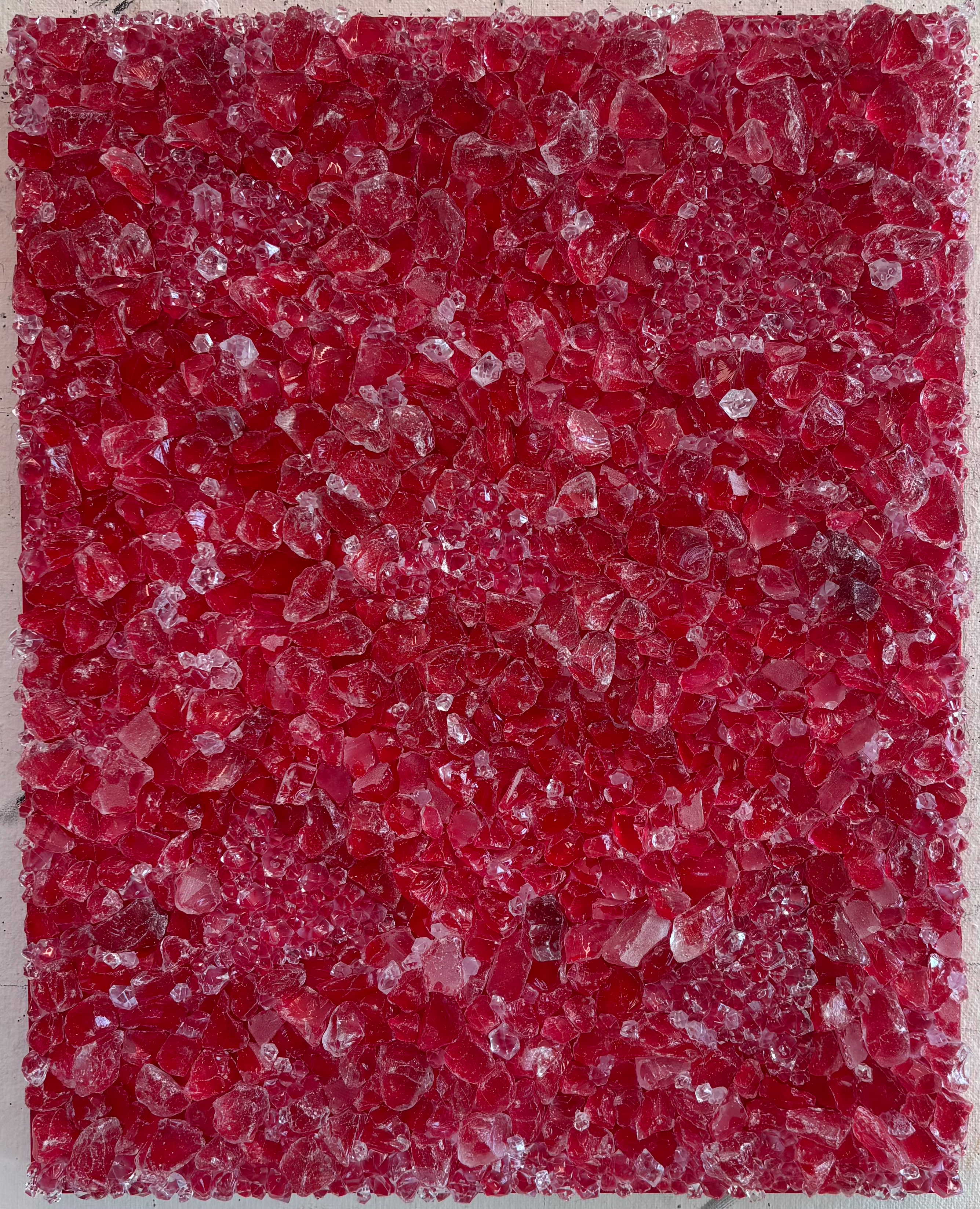
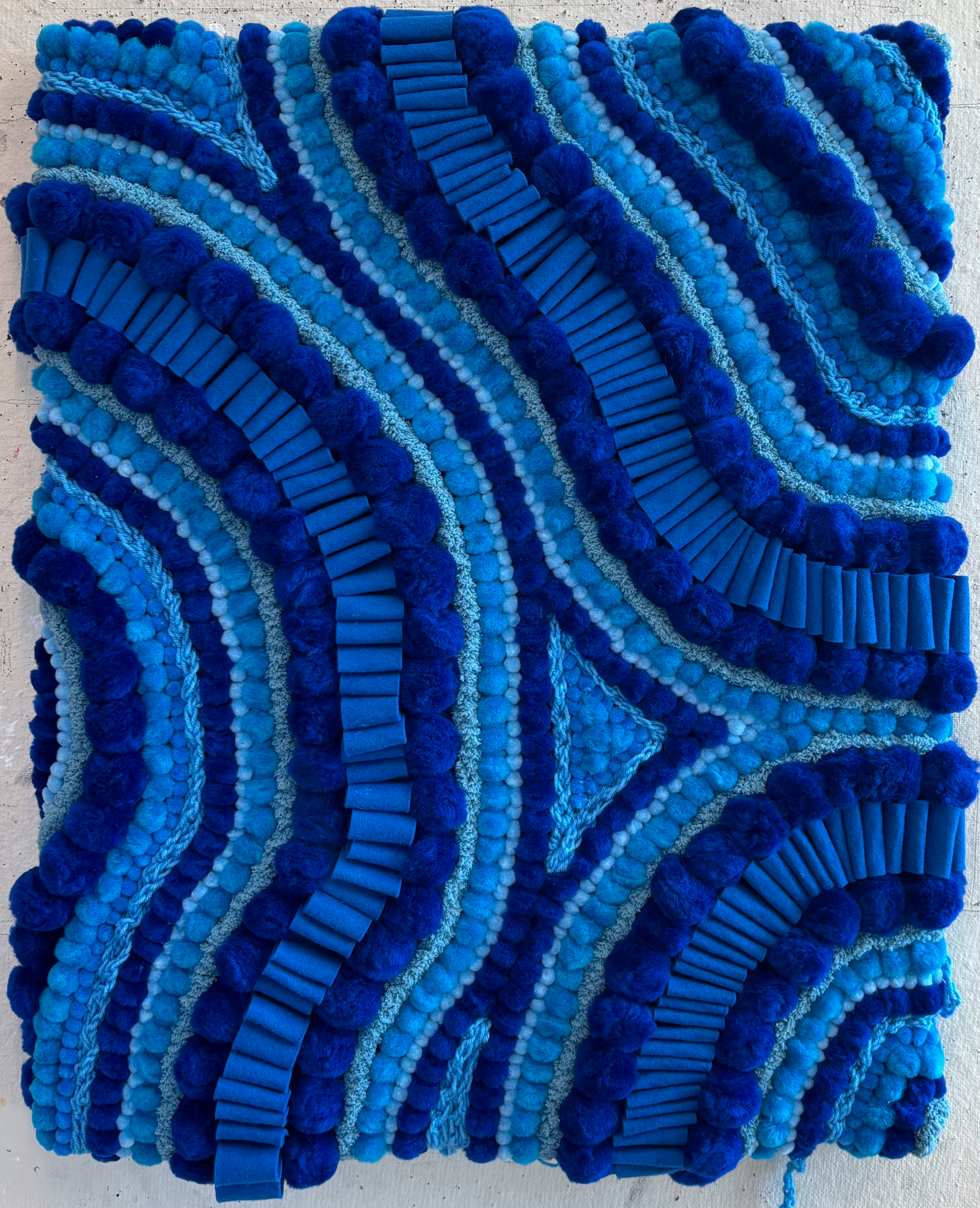
As a child, I loved to draw and experiment with all different art media. My family and friends were always so amazed by my creations but I never thought my art was that impressive. One thing we all agreed on was that I was good at helping people. When I found the field of art therapy it was a perfect fit for me. As a sensory based person, I tend to explore my art on a sensory-based level. I incorporate textures, paints, design elements, color, sensations, feelings, and emotions into my work. This series includes three large-scale, monochromatic, mixed-media pieces focusing on color, texture, and shape using nontraditional materials. My works express my desire for the sensory, they invite tactile integration with visual stimulation. The design was created improvisationally, and the colors were chosen with intent. The three primary colors; yellow, blue, and red were chosen to stimulate grounding and familiar senses in the viewer. Yellow is said to promote positivity, blue stimulates calm, and red promotes bold and intrepid feelings. My art invites its viewer to interact on a sensory level: to look, touch, feel, and fully immerse themselves into each piece and be able to associate it with emotion; without judgment. As you view, notice how each artwork feels within you, where you feel it in your body and any associations you may have. Viewers are invited to write their word associations and place them in the corresponding jar in front of the work.
Thesis Abstract
Color plays a significant role in human life, from alerting one to dangers to providing health information. Color can activate human emotions and the senses, for example, cool colors such as blue and green can bring calm sensations, while lighter colors like yellow and pink can stimulate positive emotions. Color can impact our environment and set the tone for our day. In art therapy color can help clients express their emotions, thoughts, and feelings. In order to explore the role of color in art therapy through the senses, this thesis used textiles and nontraditional materials hot glued onto three acrylic painted 24in x 30in x 1.5in canvases. Each canvas encompasses one primary color: red, blue, yellow; intricately hand-designed by a variety of materials of that one color, inviting a visual tactile experience. The role of color in stimulating emotions and senses in a therapeutic setting is discussed.