Artist Biography
Gabriela was born in Merida, Venezuela, where she began her college career majoring in Graphic Design at the University of Loos Andes. After being granted a full scholarship, she transferred to Endicott College, and she is currently a graduating senior. Gabriela is fascinated by the power of images, and her work is mainly focused on editorial design, illustration, and visual narratives. She has been recognized with different awards which include the first place in the Latin American Design Awards in Student/Illustration, first place in the Student Invitational Exhibit at Endicott College, and first place in the poster design competition Burger Cartel, as well as recognition for high academic performance in her home university. Gabriela is also represented by Lemonade Illustration Agency.
Please feel free to visit her online portfolio at www.gabrielaguerrero.net or contact her at gabrielaguerrero.di@gmail.com
Thesis Abstract
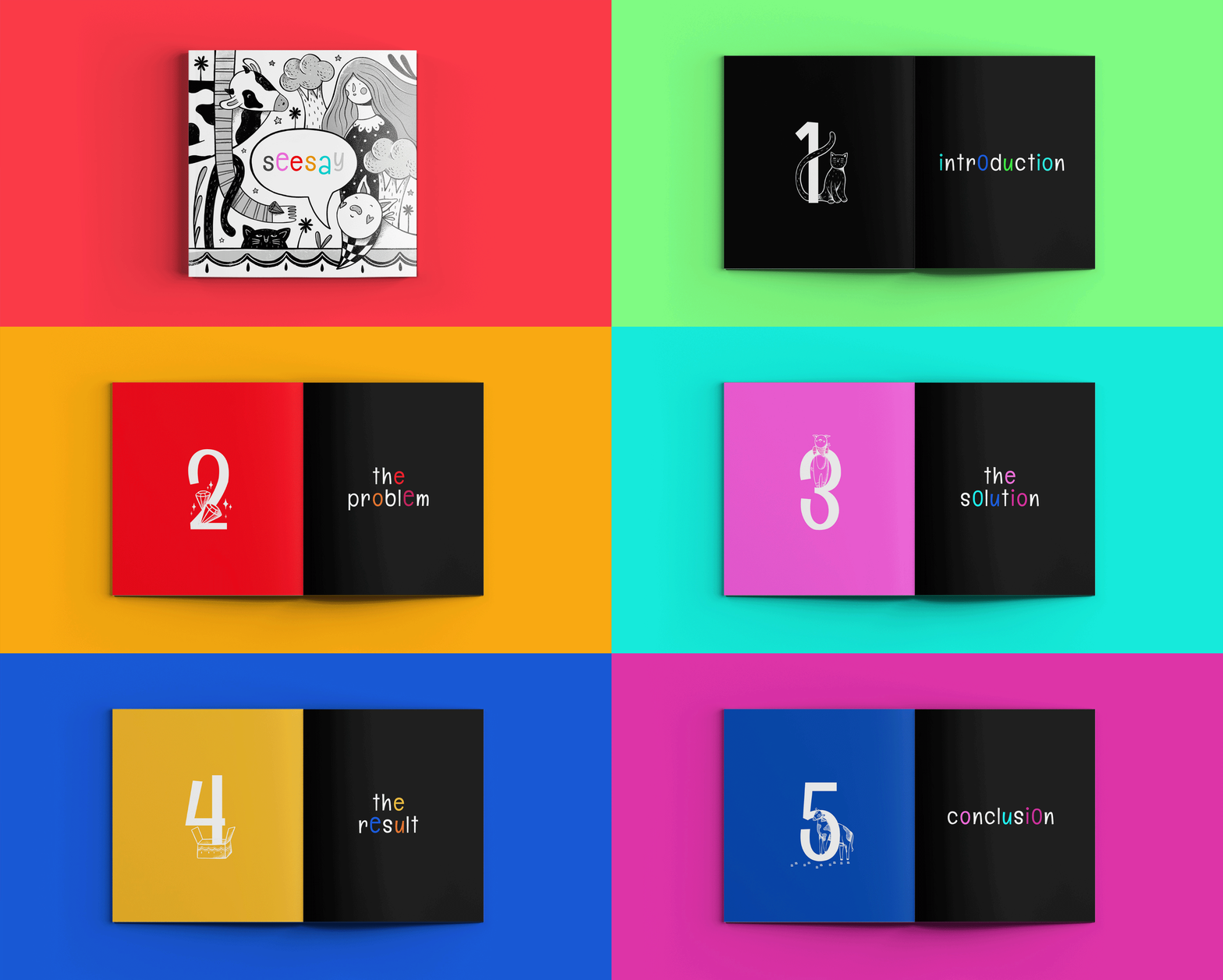
Seesay is a pioneering visually-coded-system that uses the potential of graphic elements and visual narratives to represent sounds of English pronunciation. The system prioritizes logic and intuitiveness, making visible important aspects of the English pronunciation and providing users with an engaging, fun, and visually appealing approach.
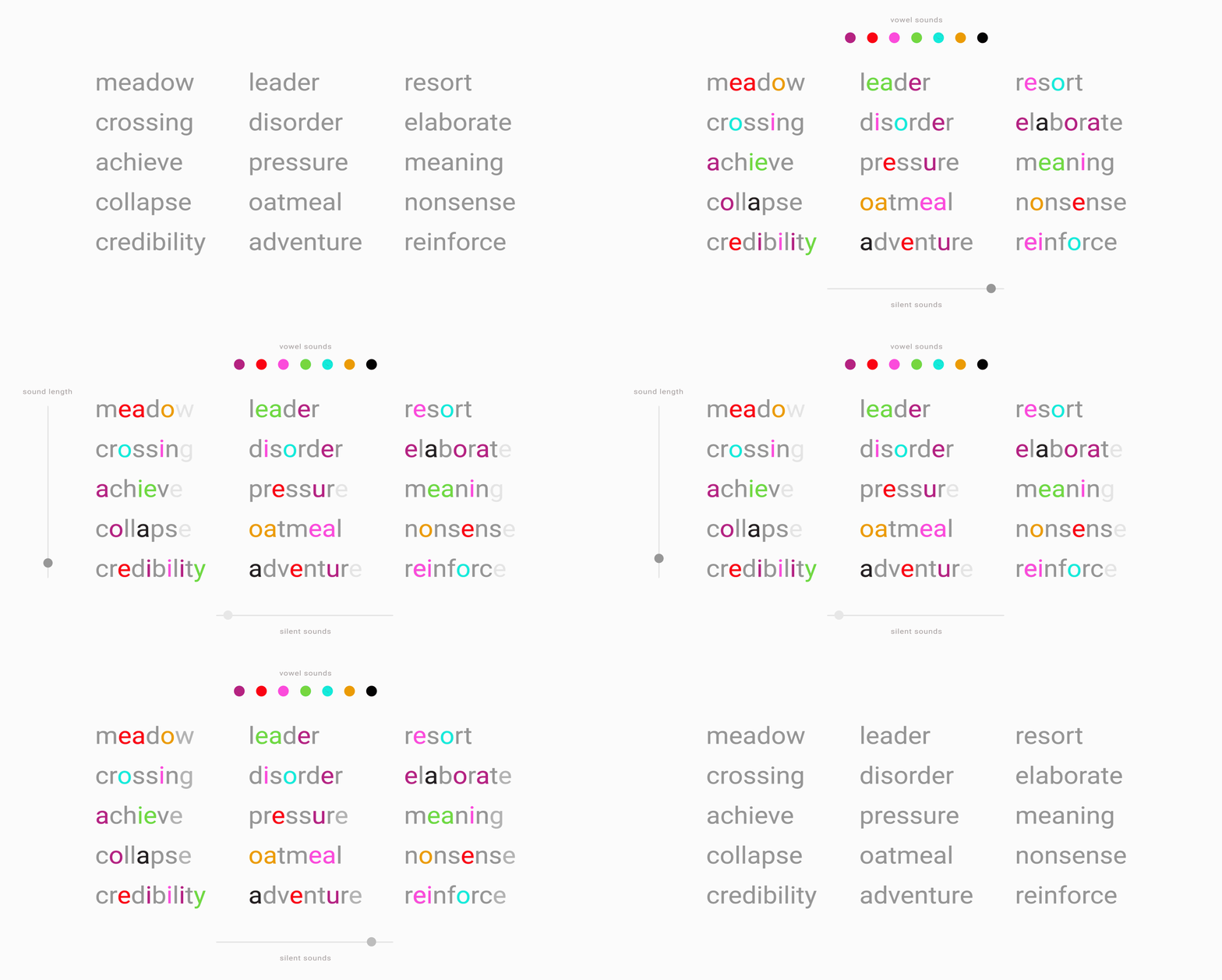
Each vowel sound is depicted by a color that contains the sound of that vowel in its name. For example, the vowel “u” is represented by the color “plum.” In this manner, every time that the users see the color “plum,” they will know that the sound that plum represents is “u,” such as in the words “gum,” “cup,” and “up.” This differs from the “u” sounds in “full,” “put,” etc.
In addition, Seesay uses visual narratives with short stories where characters use exclamations that emit the sound of the vowel that is being taught. For example, in the story of the sound “u,” a girl eats a “plum gum,” and she says “yum!” It helps to reinforce the sound and makes the learning process more fun, engaging, and easier to memorize.
Silent Sounds are represented with light gray color, which gives a sense of something that is “disappearing.” Hence, when users see a light gray, they will associate it with the “absence” of something, understanding that the letter does not have any sound. Lastly, Sound Lenght is represented by making some letters longer than others, as it resembles our natural perception of the real world, making it easy to interpret and memorize.


