
Artist Biography
Hey, my name is Amanda Tierinni. I am a graduating senior from Endicott College with a BFA in Graphic Design. I have always had a love for art in all forms and have always loved using art as way to express myself. Growing up, I was never the strongest academic student but when I got to high school and started taking different kinds of art and design electives, it very quickly became a passion of mine and something I knew I would want to continue as a career. As a designer, I would describe myself as organized, driven, compassionate, simple, competitive and enthusiastic. I would define myself as a creative problem solver who strives to help people achieve their goals through strategy, strong brand attributes and an active social presence.
All in all, my favorite thing about being a designer is dreaming up a concept and then watching it come to life through design and eventually become a tangible piece of someone’s brand or company. My goal is to work in either a freelance design agency or work in house within a company’s branding department.
For more of my work check out my portfolio: designsbytierinni.com
Thesis Abstract
Throughout world events such as the pandemic and reconnecting with my family and friends through playing games, I decided on creating my own board game for my senior thesis project. Not only did I want to design one, but I wanted to explore the mechanics and strategy of game design as well. Several months of work and game testing later, I would like to present Hidden Message.
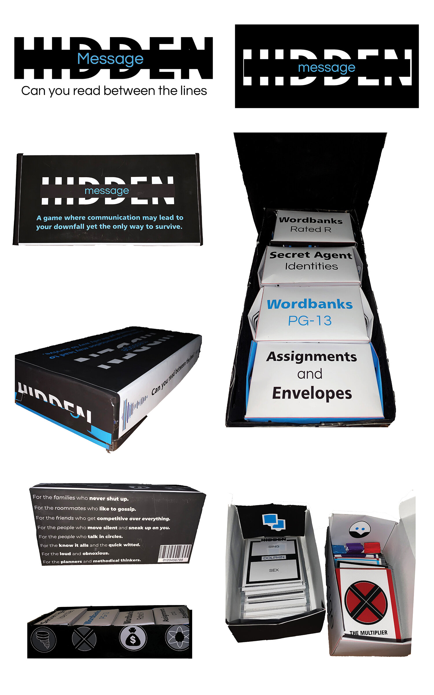
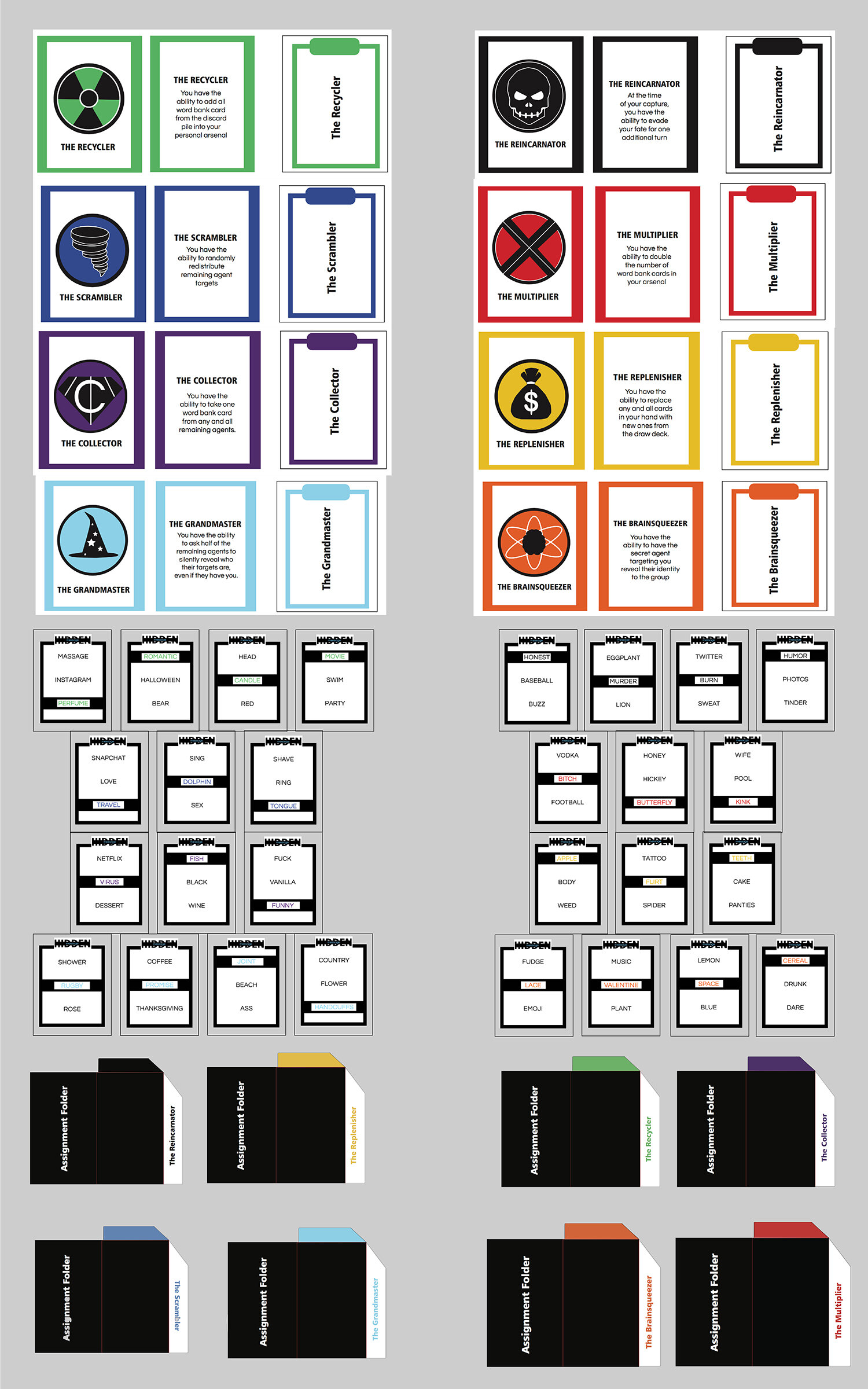
Hidden Message is an adult party game that incorporates strategy, storytelling and word association into a fun yet competitive game for every type of event and personality. After I developed the narrative behind the game which is secret agents who are trying to capture opposing agents and recruit them onto your team. Then I decided what kind of game I could create that I and people in my age bracket enjoy playing. From there, it was easy to work backwards in order to create something simple yet fun.
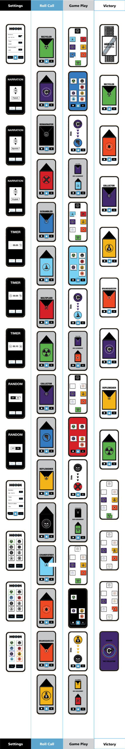
I started by developing a brand and visual identity to the game. Throughout my research I discovered that a lot of products in this market are overly simplified and I felt I could do something similar but elevate the look to gain customer traction. I started with the name and logo which consisted of a neutral color palette with a sharp blue color for accents. It’s a visually simplified logo with a fun and flirty tagline to rival the looks of the competition. Similarly, the package design has a simplistic feel but has pushed the limit due to the use of patterns and body copy to bring a little more of the narrative into the design. The game elements combine the individual qualities of each agent and the existing color palette. I created logo identities for each character and word association cards with a cohesive visual look to them. I also designed and wrote the copy for the rule book as well as a separate app that comes along with the board game set. The app is designed to set up the game digitally in order mirror the action that will unfold over the course of a round. The app is also meant to merge the game pieces with the narrative so the storytelling happens naturally and no player has to take on that role.