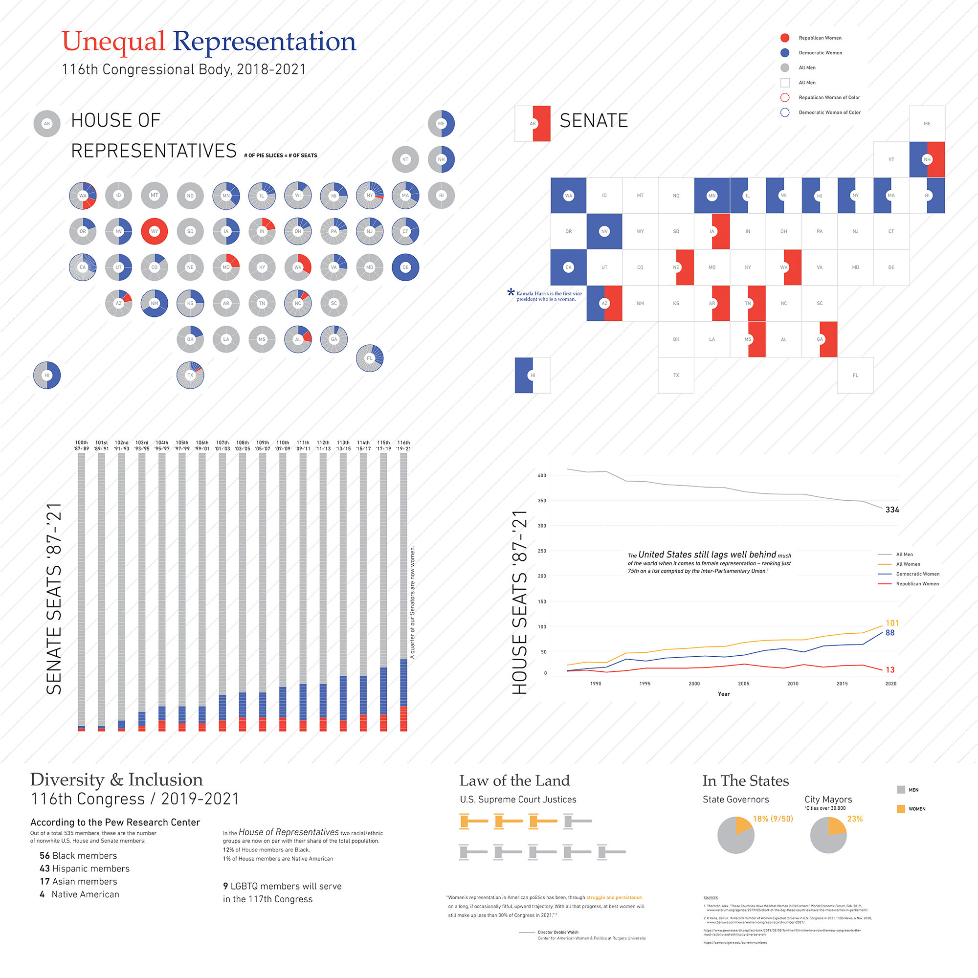
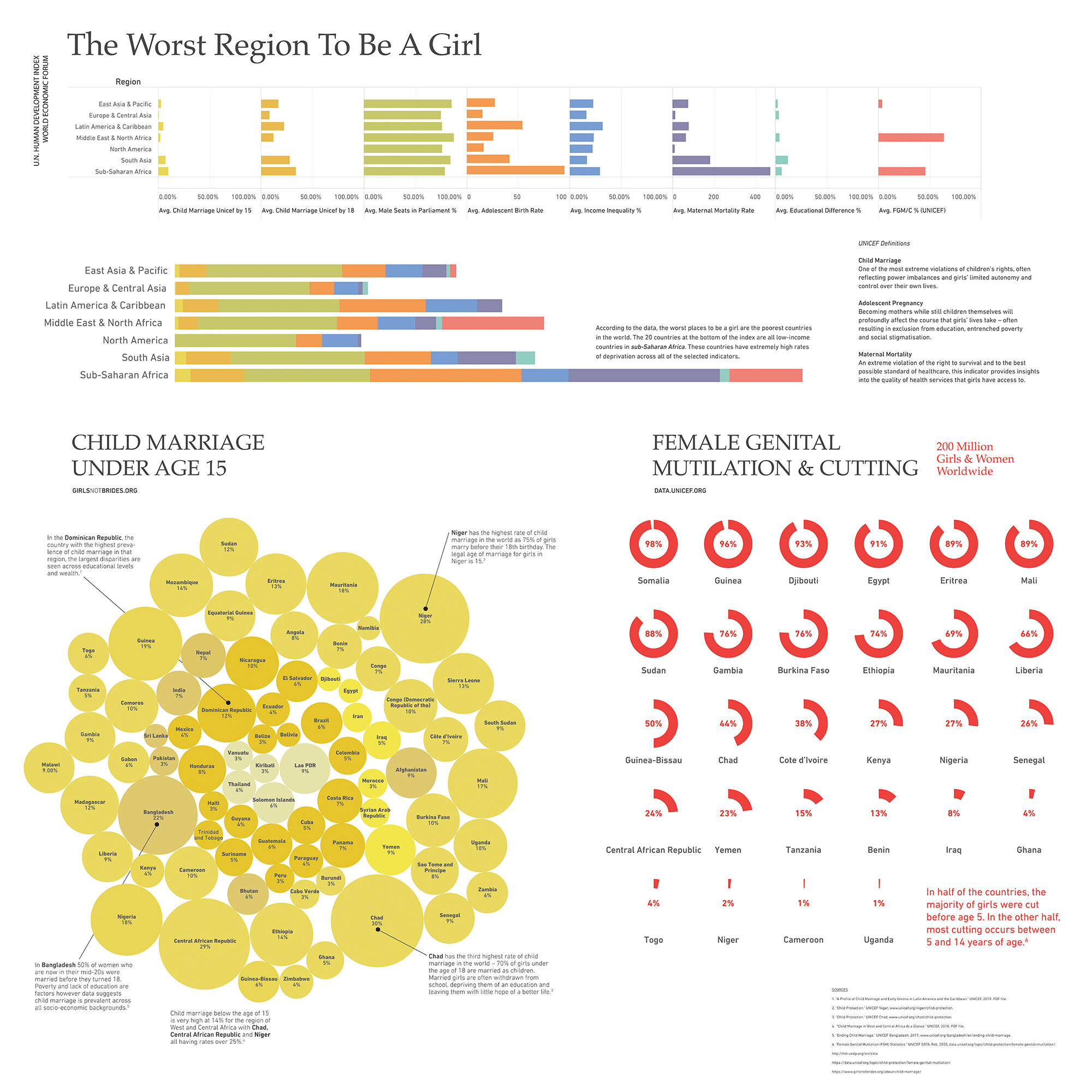
According to the World Economic Forum’s 2020 Global Gender Gap Report, we won’t see gender equality for at least another 99 years. The United States’ current global gender gap ranking is #53, far below most other comparable peer nations.
This body of work focuses on data and information design in communicating the inequality of women on a national and global scale. This work is grounded in research, the information and data obtained from institutions such as the United Nations, World Economic Forum, UNICEF, U.S. Labor Department, Census Bureau and many other reputable sources. As such, I was able to examine the factors that determine the health, safety, economic opportunities, political representation and overall gender parity of women. I explored the countries that are doing a better job at attempting to reach gender parity and the factors that contribute to this. In addition, I identified the worst places for girls and women to live.
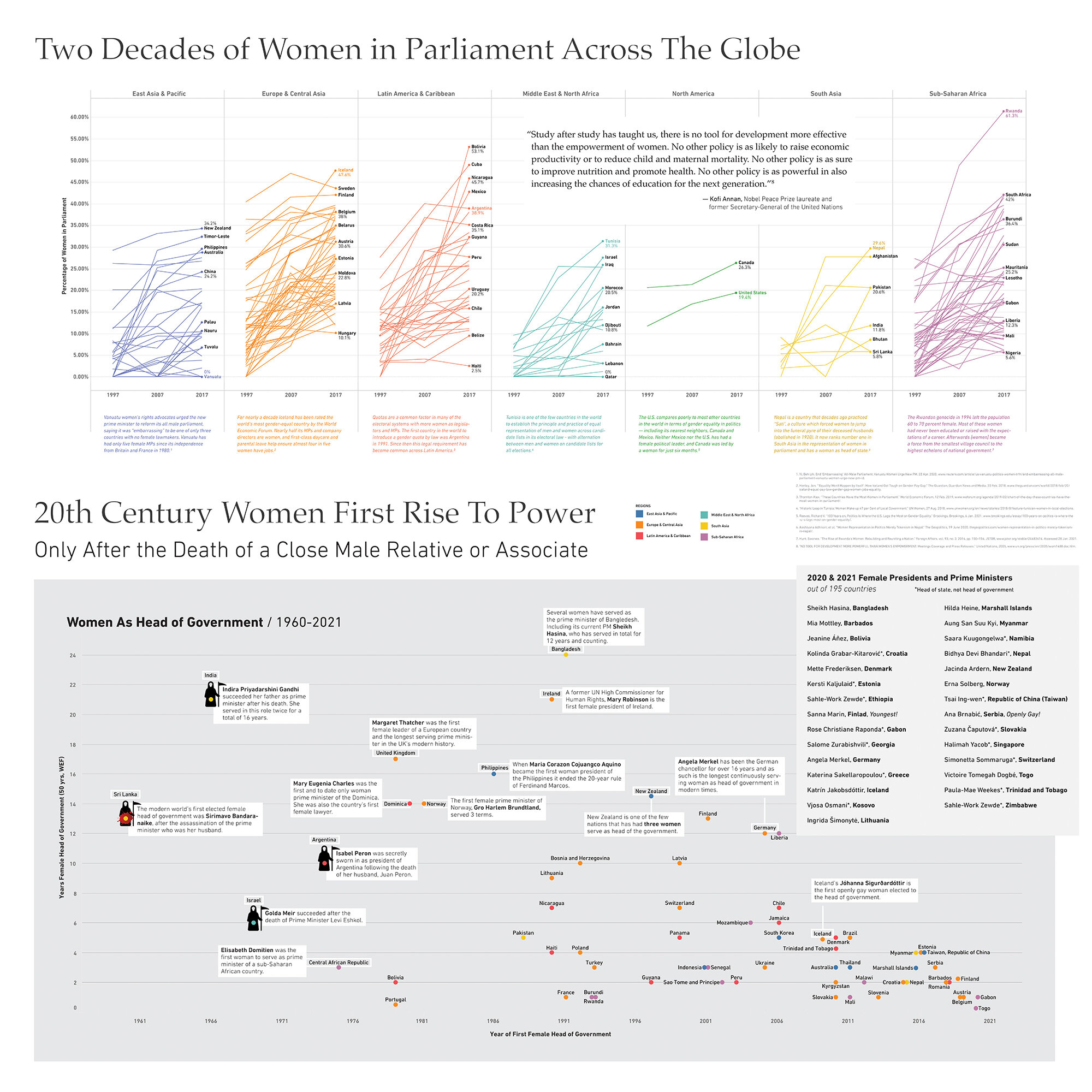
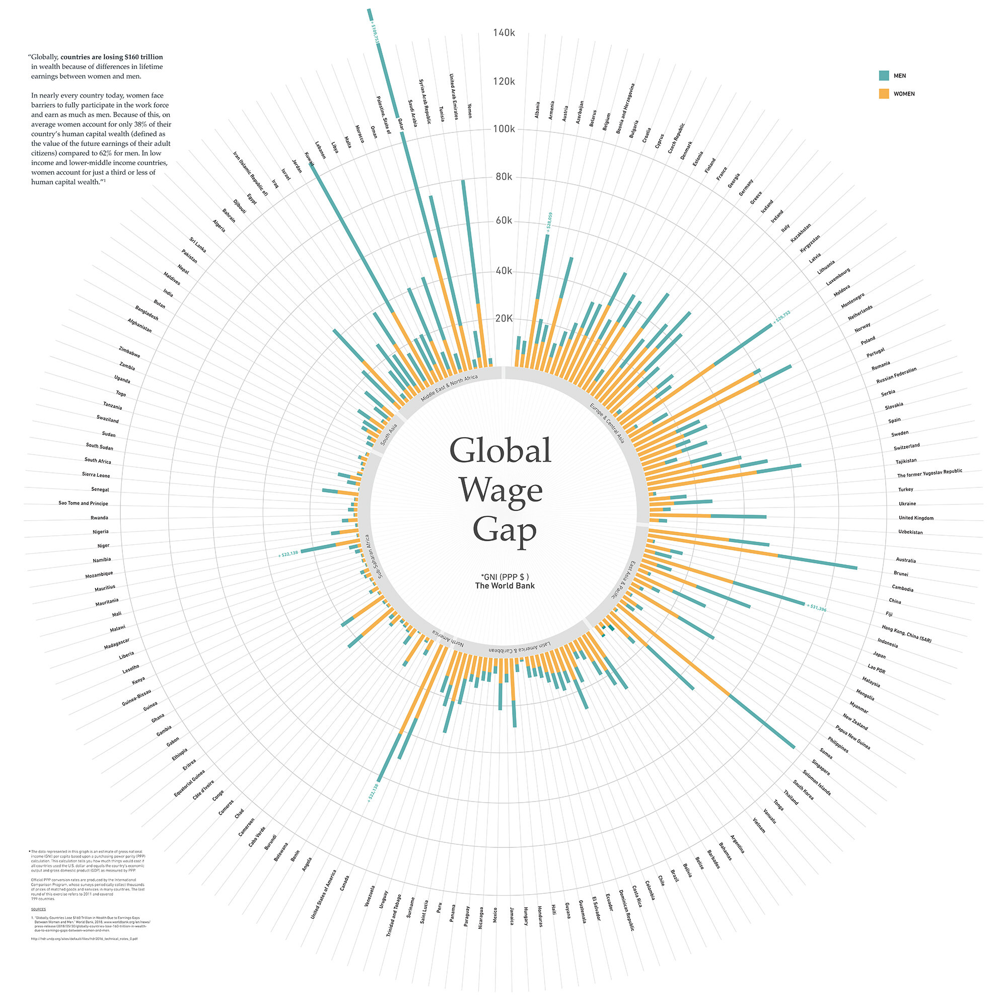
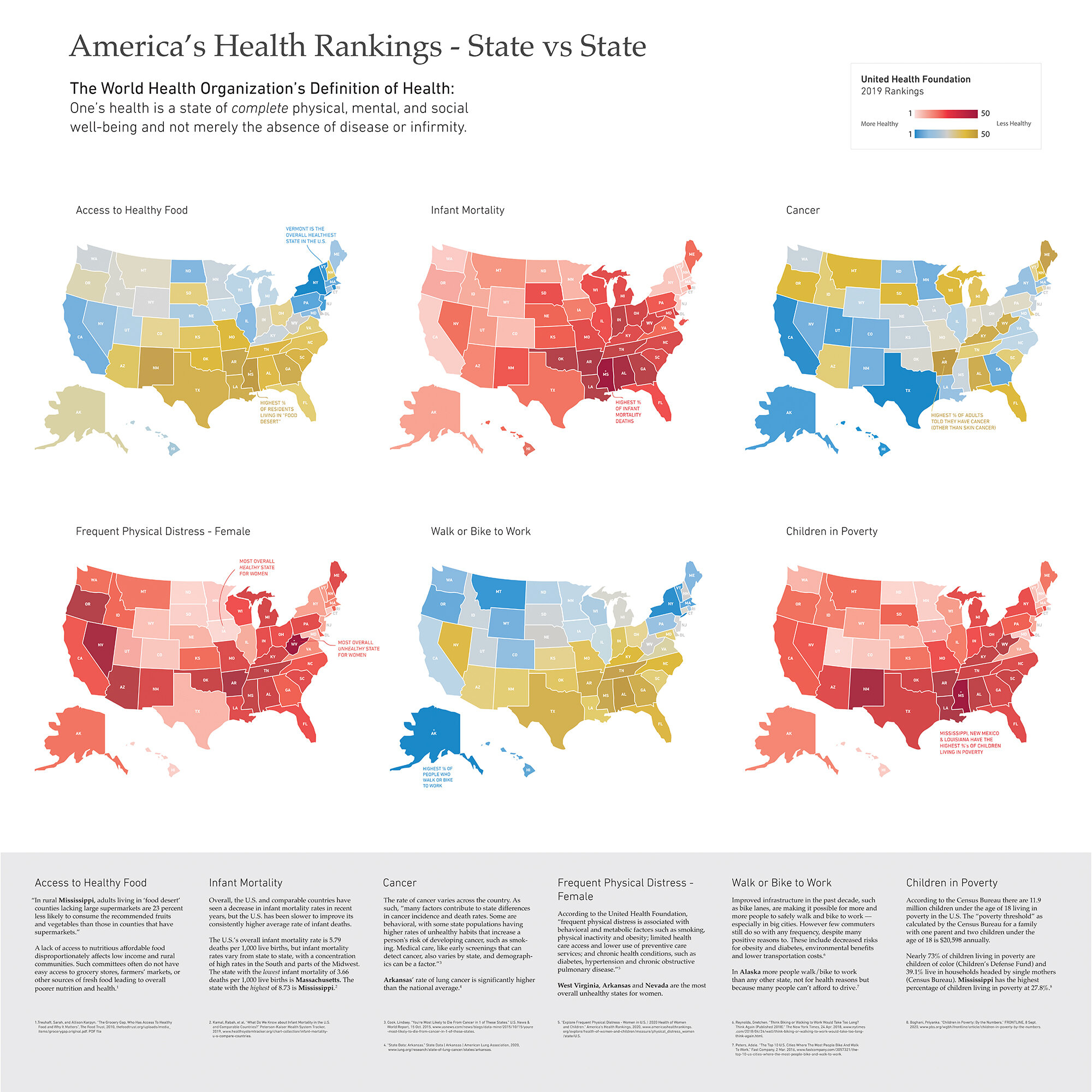
I was also interested in where the United States fell comparatively to other countries especially those countries that are quite similar. To this end I took a macro/micro approach juxtaposing where the U.S. stood on a global stage with those dimensions and measures specific to the United States. This included factors such as the number of women in government, female heads of state and industry, differences in gross national income, maternal mortality rates, adolescent birth rates and access to education. Throughout this process I discovered the narrative I wanted to tell about women and their prospects in this world both on a global and national level. I added notes and quotes to the information designs to help contextualize some of these findings.
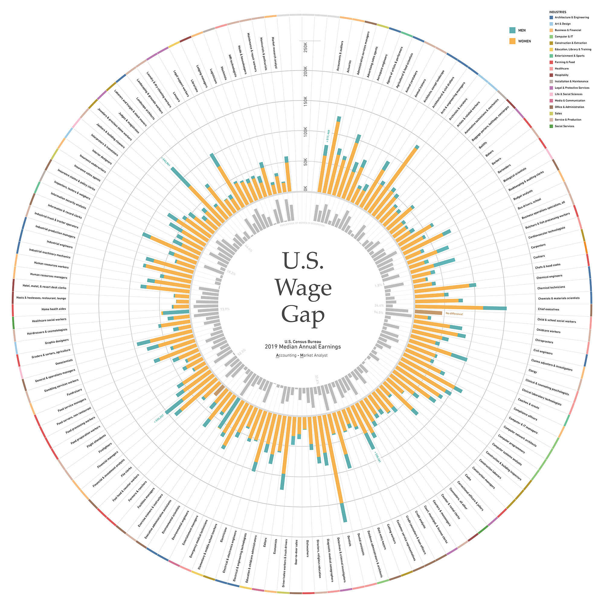
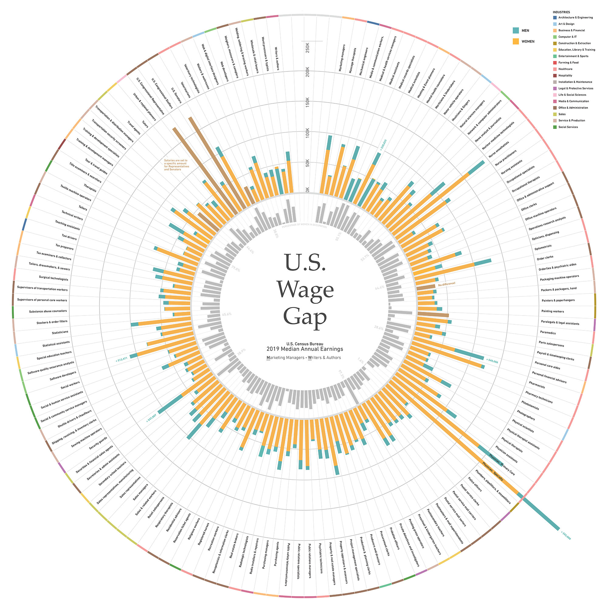
During this process, I learned and utilized Tableau, a data analytics and visualization tool which helped me to identify patterns, see trends, make correlations and spot outliers within the data. From there I worked extensively in Adobe Illustrator, re-visualizing and designing the information graphics and overall information design to communicate clearly to a broad audience. My efforts involved the deliberate and effective communication of complex data through visual means, including attention to typography, iconography, color and layout. For example, in the U.S Wage Gap designs, separate linear bar graphs are integrated and transformed into a multi-level circular structure. This structure allows one to comprehend the bigger picture at a glance and upon further inspection uncover more granular elements of the data. One can discover what specific occupations earn annually, which occupations make more and less overall, which occupations have the greatest and least pay gaps, what percentage of women are in each occupation, and what industries support higher salaries. Utilizing the design principle of “layering and separation”, elements within the designs are carefully composed and organized in a hierarchical system so that the inter-related levels of information are clearly communicated, allowing one to easily see and understand their connections, make comparisons and draw conclusions.
In support of this work I would like to thank Endicott College and especially the Dean of the School of Visual and Performing Arts and Eijk and Rose-Marie van Otterloo Endowed Chair, Mark Towner. I dedicate this body of work to the incredible women in my family who have come before me and paved the way for so many of the opportunities I have been afforded. These women are Beatrice Cunha, Malvina Currier, Agnes DaCosta and Phyllis Currier.